Frances Magee
Artist
In her North Belfast garden, Frances Magee transforms carefully tended plants into luminous cyanotypes – where texture, imperfection and light combine in work that feels timeless.
There is something quietly appropriate about publishing Frances Magee’s work at the beginning of March. It is a month poised between endings and beginnings – crocuses already faded, daffodils hesitating on the verge, hellebores holding court in beds that only weeks ago looked stripped bare. In Northern Ireland, March is rarely decisive. Light fractures into showers, UV levels drift unpredictably, and the promise of spring arrives in fragments. For Frances, that instability is not something to battle. It is part of the making.
“The weather isn’t something you work against,” she explains. “It’s a collaborator.”
Her cyanotypes are not produced despite the season – they are shaped by it.
From Garden Journal to Cyanotype Practice
Frances has been working with cyanotype for nearly twenty years. She did not come to it through photography or formal chemistry training, but through gardening. When she first began tending plants seriously, she made tiny cyanotypes – three or four inches square – to keep in a gardening journal. When a new leaf unfurled or a flower opened, she would place it directly onto prepared paper and let sunlight do the rest.
“If you take a photograph, there’s not always a sense of scale,” she says. “But this is the exact thing. It’s one-to-one.”
The process was initially about recording. But slowly, something shifted. She became fascinated by the transformation itself – by the moment when light triggers chemistry and an image begins to reveal itself in deep Prussian blue.
“It’s a proper magical thing,” she says. “You’re watching sunlight trigger this chemical change, and then the image is revealed.”
The journal evolved into a practice. The record became the artwork.
Repetition Without Replication
Cyanotype is rooted in repetition: grinding pigments, mixing solution, coating paper, arranging plant, exposing to light. But the outcome is never the same.
“You’re using the same ingredients,” she explains, “but nothing’s ever the same.”
Frances grinds her own chemistry, mixing it as close to the original Victorian formula as is legally possible. She uses handmade cotton rag paper sourced from traditional mills, where fibres vary subtly in density and absorption. Even the act of mixing cannot be identical from one session to the next.
“The repetition is lovely,” she reflects. “But you never get repetition of results.”
Light, humidity, paper fibres and plant structure all intervene. The unpredictability, she admits, becomes addictive.
Choosing Plants for Texture and Form
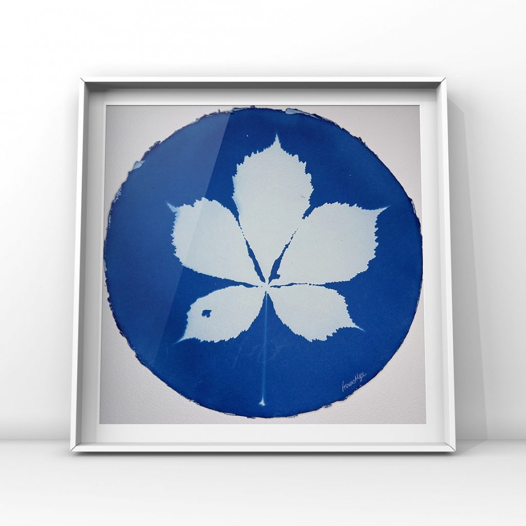
Plant selection is deliberate. Frances favours structure and intricacy – forms that allow light to travel through them. Fern-like fronds, jagged leaves, drumstick alliums, and sculptural hellebores translate beautifully. Dense blooms, such as many sunflowers, can flatten into blocks, losing nuance.
“I definitely pick things with a view to printing,” she says. “Lots of texture. Lots of depth.”
This year, hellebores are reigning supreme. Their waxy petals and deep purples dominate early spring beds. Frances recalls seeing them massed at Belfast Castle one winter – vivid against bare soil – and immediately buying every variety she could find.
“They were just unbelievable,” she remembers. “Everything else was gone, and there they were.”
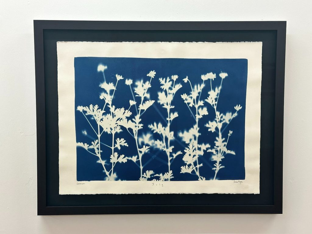
Elsewhere, lilies are emerging early, daffodils are preparing to open, and alliums are beginning their ascent. Crocuses, however, “came and went” almost unnoticed this year. In another season, fifty or sixty allium bulbs were eaten by squirrels before they bloomed.
“That’s just the nature of the beast,” she shrugs.
Imperfection as Character
Not every leaf arrives flawless – and that is part of the appeal. Slug holes, insect bites, weather tears and ragged edges are printed without apology.
“Sometimes it pains me to cut the plants,” she says. “But when they’ve gone through the whole cycle and they’re perfect – or perfectly imperfect – that’s when I print them.”
Those marks become compositional elements. Pest damage introduces unexpected geometry. A tear becomes a line of light. The garden’s micro-battles become visible in the final piece.
“It might be that the slugs have come and there are holes in it,” she says. “And it looks really fascinating. And you think, I’m just going to print that anyway.”
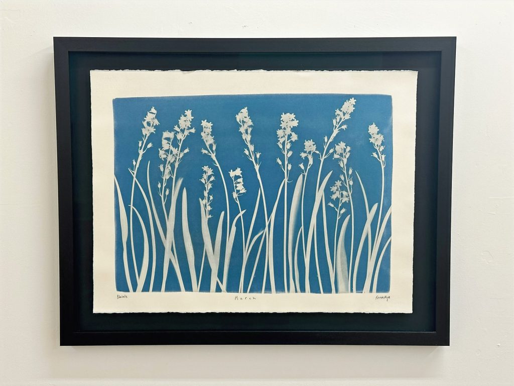
The variables of the garden are mirrored by the variables of the process. Handmade paper absorbs solution differently. Northern Irish sunshine alters exposure times. Wind may shift a stem mid-print. UV levels in March are vastly different from those in July. Nothing can be entirely controlled.
“It’s highly unpredictable and organic,” she says. “You’re doing the same thing, but it’s not controllable at all.”
Permanence in a Fleeting Season
Gardening unfolds slowly – seed, soil, nurture, bloom. Printing, by contrast, can be urgent. Paper is coated in darkness. Plants are arranged with care. Exposure must be judged in shifting light. The rinse reveals the transformation.
The act of printing becomes, for Frances, a way of memorialising the moment.
“It closes the loop,” she says. “It’s like capturing it in its perfect state.”
In March especially, that act feels significant. Nothing in the garden is fixed; everything is in transition. Cyanotype creates permanence from that fleeting state.
“It cements it in my mind,” she explains. “I can look at it and be right back at that sunny day when I made it.”
Blue That Never Dates
Despite its origins in the 1840s, cyanotype feels strikingly contemporary when framed. Frances describes its blue-and-white palette as timeless.
“It’s like a white shirt and blue jeans,” she says. “It never goes out of fashion.”
The colour recalls sky and sea, elements that do not belong to a single era. When mounted and displayed, the prints carry a modern clarity, yet beneath that aesthetic lies soil, labour, vulnerability and patience.
Almost Crying at the Market Stall
Frances laughs at the idea of being a marketer. Instagram posts require effort. “I have to force myself,” she admits. But markets are different.
She loves meeting people, talking about soil types and north-facing gardens, discussing hellebores and lilies. She enjoys explaining the chemistry and hearing stories of other people’s plants.
And when someone buys a piece?
“It nearly makes me crack,” she says. “I almost cry.”
The prints feel necessary to make – almost compulsive. When someone chooses one and carries it home, it feels like a profound acknowledgement of the work and the season embedded within it. When someone returns for a second piece, it becomes even more meaningful.
“I’m so grateful,” she says simply.
March, Held in Blue
Early spring is a season of uncertainty – light stretching but not yet reliable, beds half-awake, colour arriving in flashes rather than in abundance. Hellebores stand resilient against cool air, daffodils hover on the brink of opening, lilies push upward earlier than expected, and alliums gather quiet momentum beneath the soil. It is a time when nothing feels entirely secure and everything is in the process of becoming. Frances’ cyanotypes sit naturally within that tension.
They hold the fragile confidence of March – the pest-bitten leaf, the wind-shifted stem, the cloud-softened exposure – and render it permanent. In her hands, this shifting season is not hurried toward summer; it is honoured exactly as it is: provisional, textured, imperfect, and luminous in blue.
Frances’ work will be on view this summer in a joint exhibition with Connie Baker Horne at Castle Espie Wetland Centre. For full details and visiting information, visit: wwt.org.uk/castle-espie
For further information, including her blog and available works for purchase, visit her website: francesmageeart.com
And keep up with Frances via social media: @francesmageeart
Support Go Leor. Get the Print. Join the Story.
Go Leor is an independent Irish arts magazine built by hand, heart, and community. Your support keeps meaningful storytelling alive – in print, in culture, and in conversation. Through Patreon, you can join as a monthly supporter and receive exclusive benefits across our tiered memberships:
Fir Bolg: Your name printed inside every issue.
Muintir Neimhidh: Your name + monthly issue delivered (UK & Ireland) and PDF issues.
Muintir Partholóin: All previous benefits + monthly editor’s dispatch.
Bradán Feasa: All benefits + help shape future articles and themes.
Your backing helps us print, publish, and grow a space for creative voices across Ireland and beyond.
The Latest Articles

Mark Bonello – Capturing the Spirit of Ireland’s North Coast
From London galleries to the North Coast studio, Mark Bonello paints light, labour, and lived experience with unwavering focus

From Donegal to Belfast – Katriona Sweeney’s Authentic Irish Design
Where Irish memory, bold typography, and hand-painted craft converge – from Donegal buses and rush crosses to Belfast walls and wearable design.

Anthony Murphy and the Secrets of Ancient Ireland
An astronomer’s path into Ireland’s ancient past – tracing how skywatching, myth and archaeology converge across the island’s landscapes.

Desima-Jayne Connolly on Building Arts Centres Around People and Place
From Christmas markets to the return of light, how collaborative programming at Flowerfield and Roe Valley places people, place and wellbeing at the centre of cultural life.

Fight Like a Girl: Ana Fish on Safer Spaces & Murals
Tracing a life shaped by movement, myth, and community – using street art to reclaim space, tell shared stories, and make the everyday world feel safer, softer, and more alive.

Finding Magic Stillness in the City: Joel Simon’s Paintings
Scenes observed slowly and held with care, where light, posture, and silence allow the ordinary street to become a quiet stage for feeling